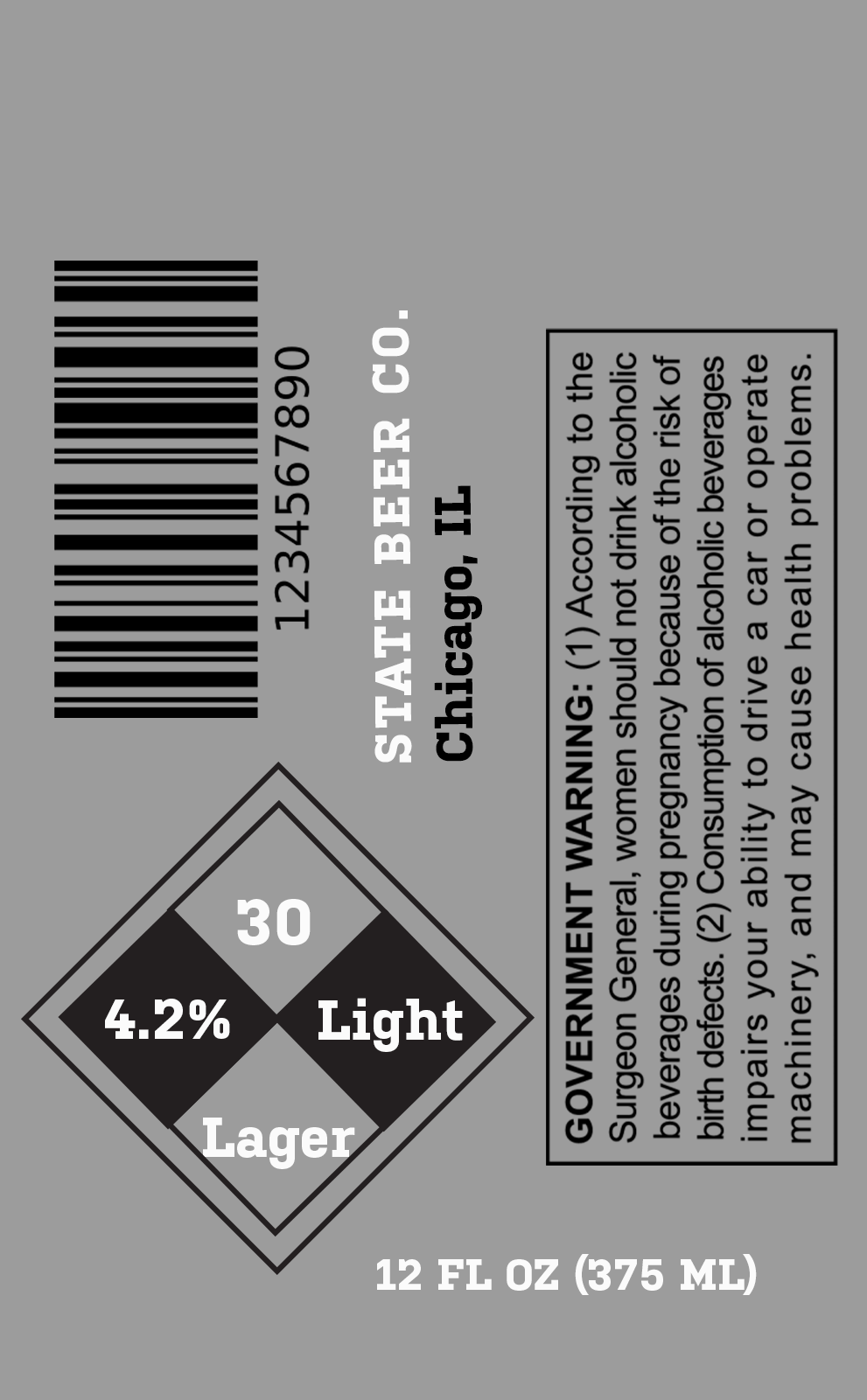
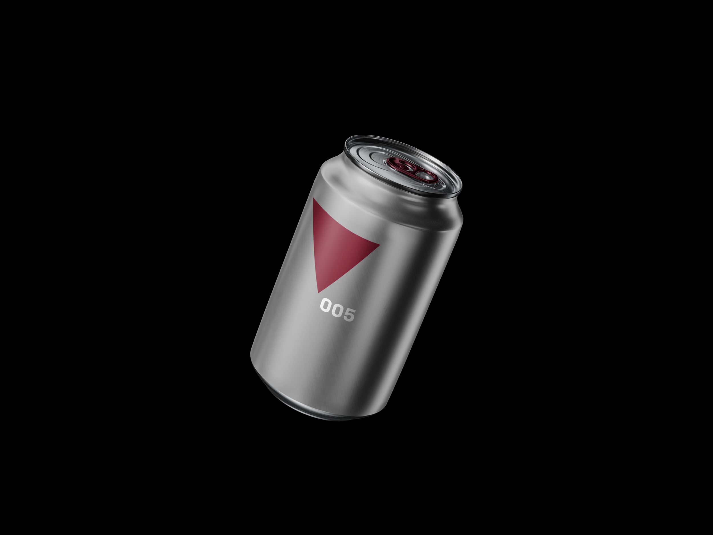
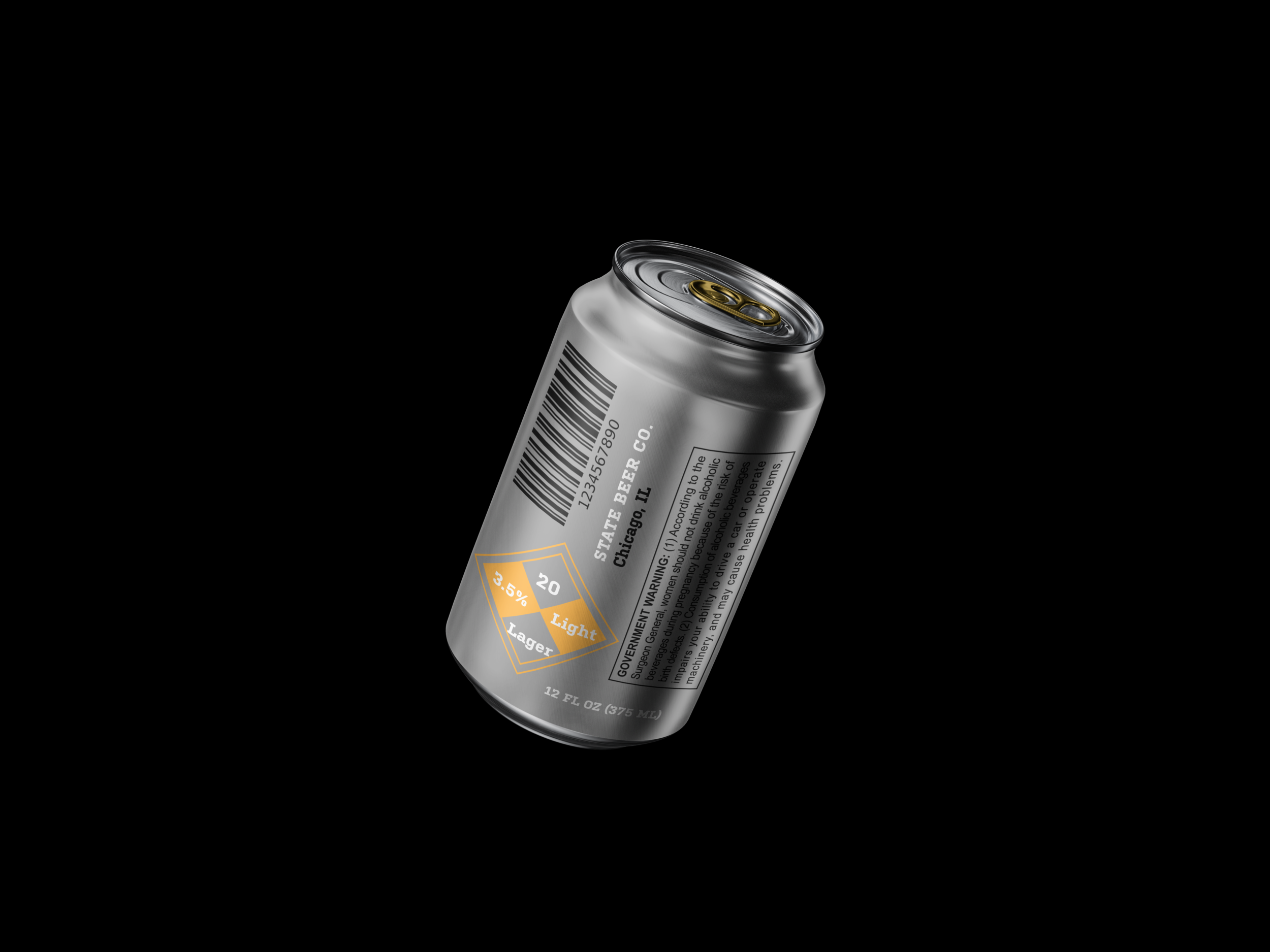
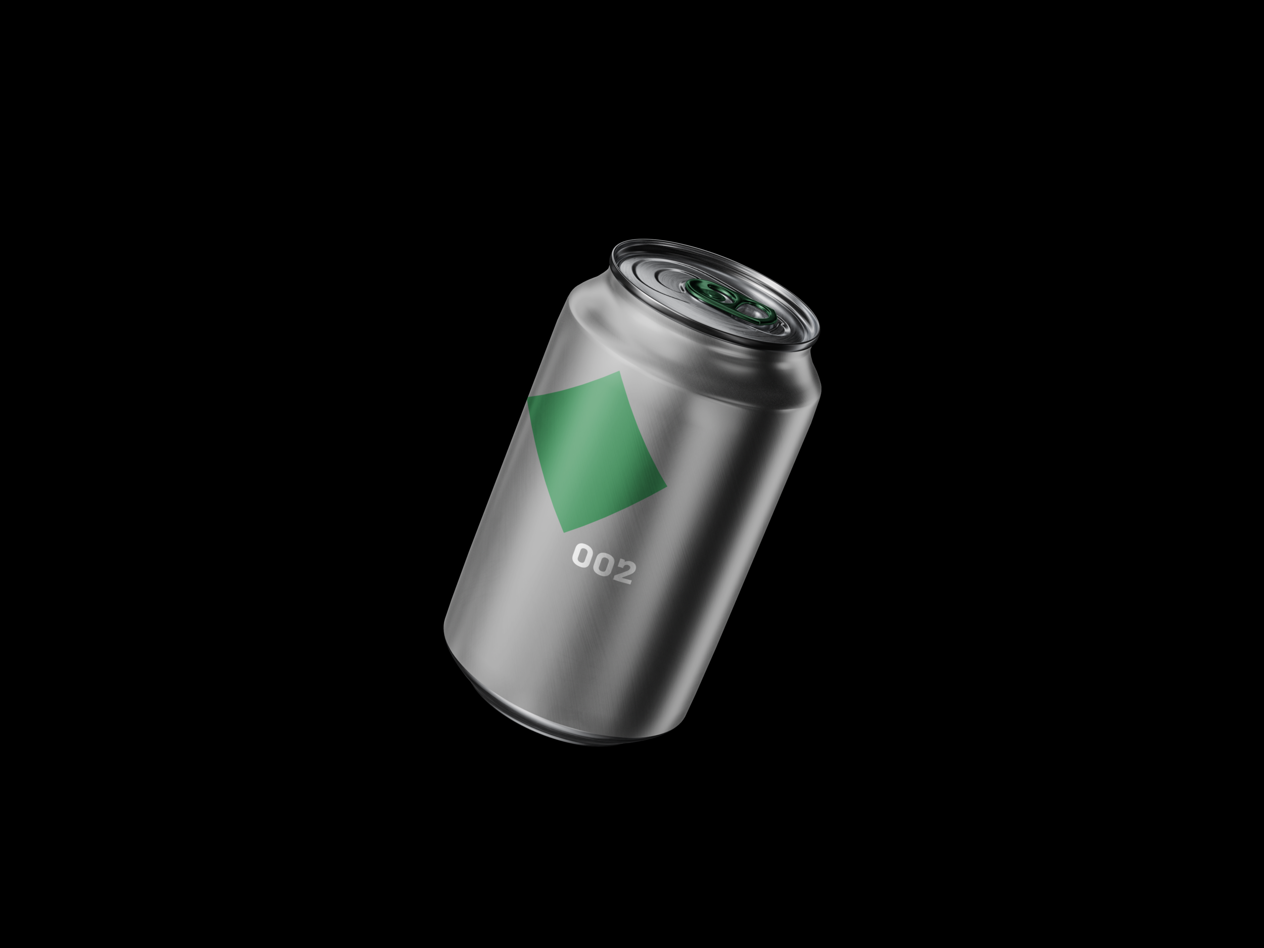
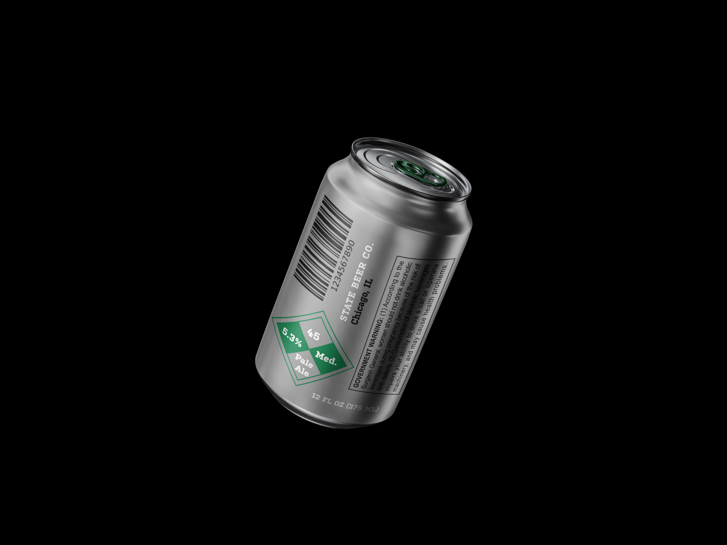
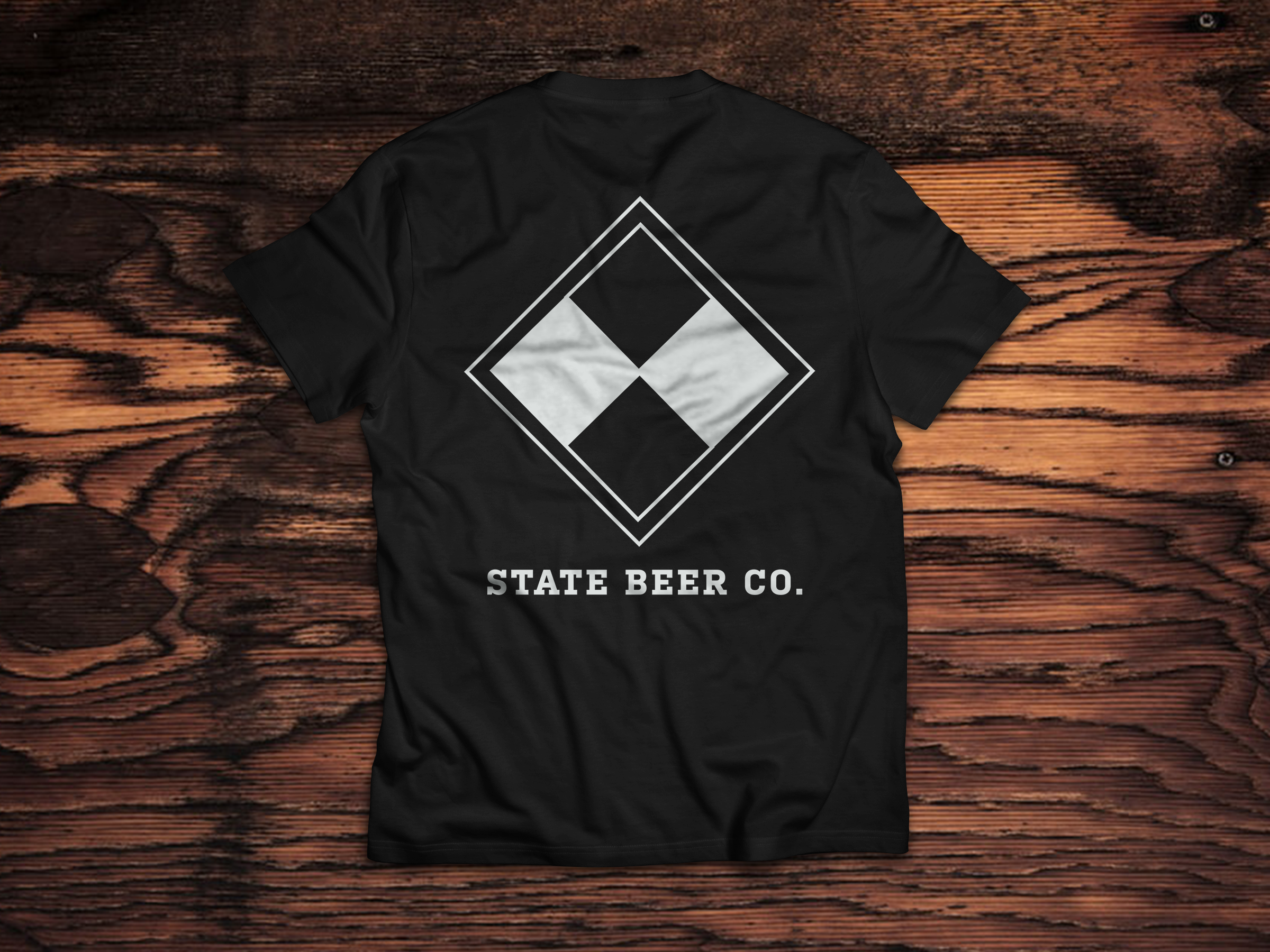
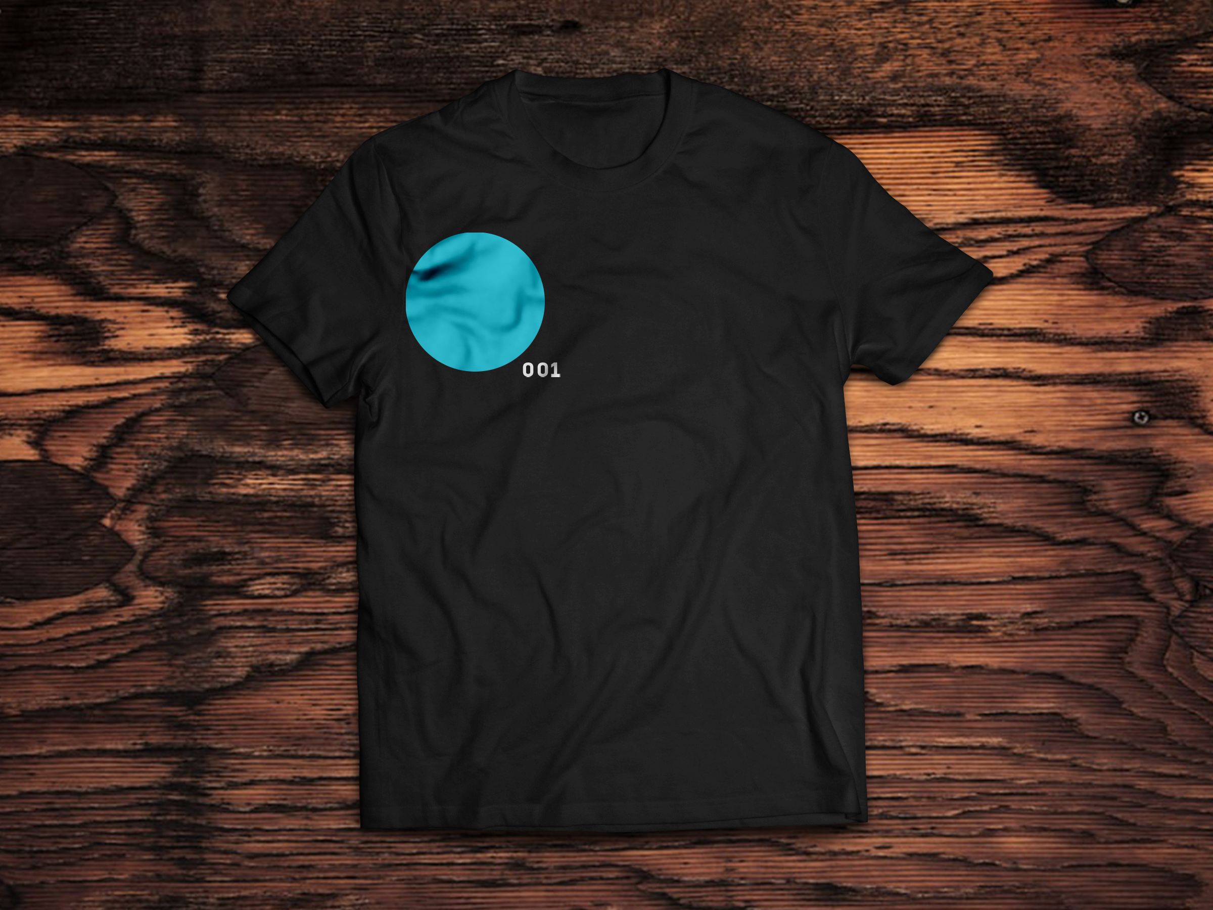
Package Design: State Beer Co.
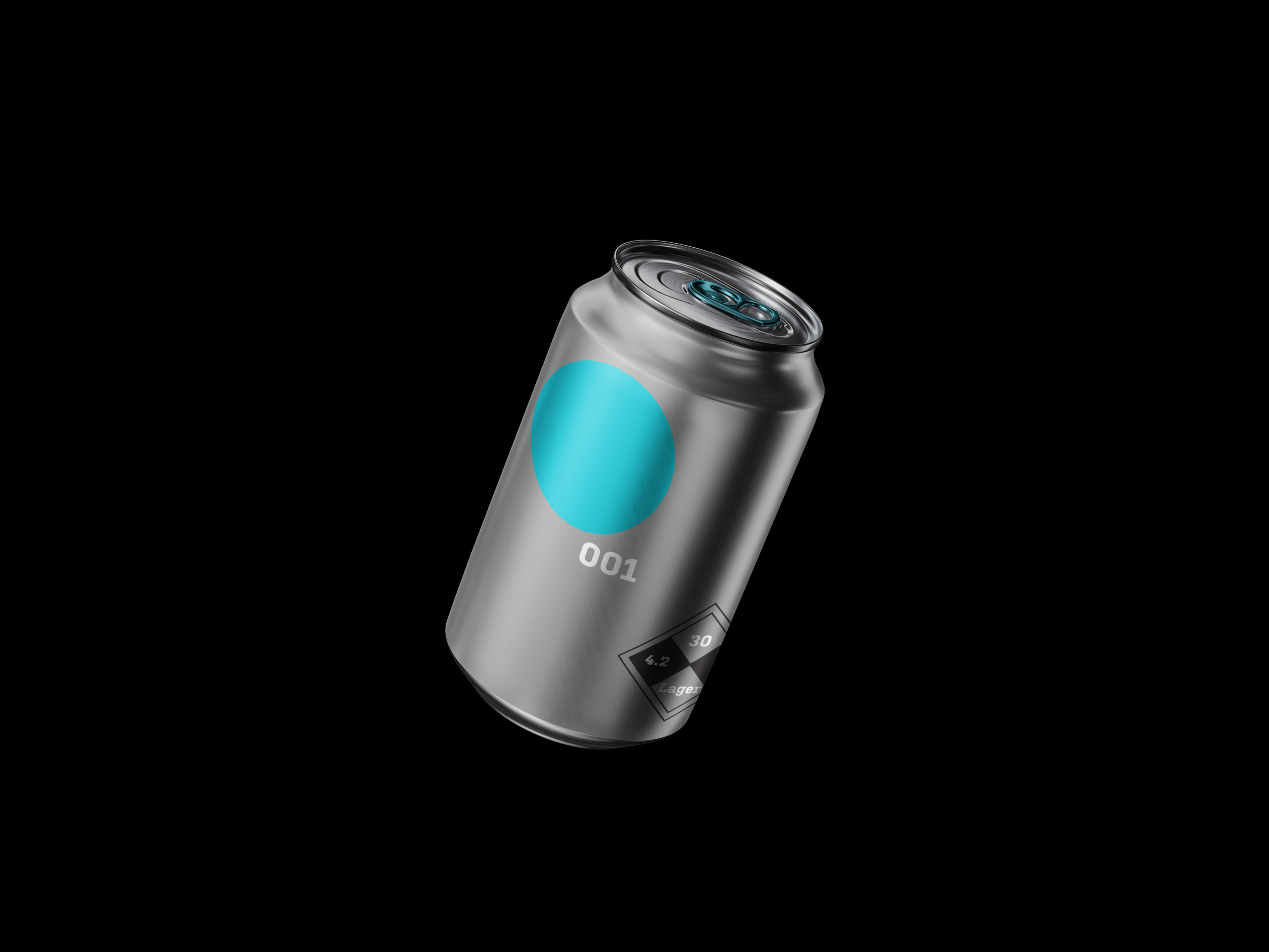
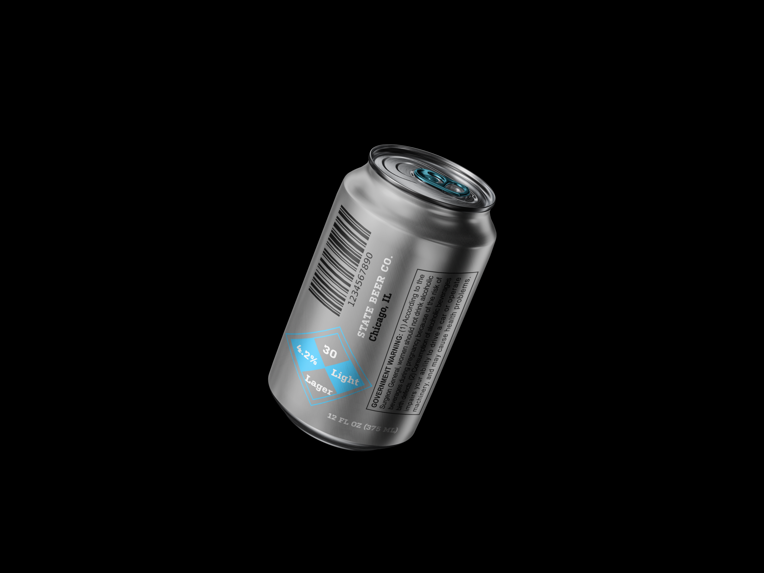
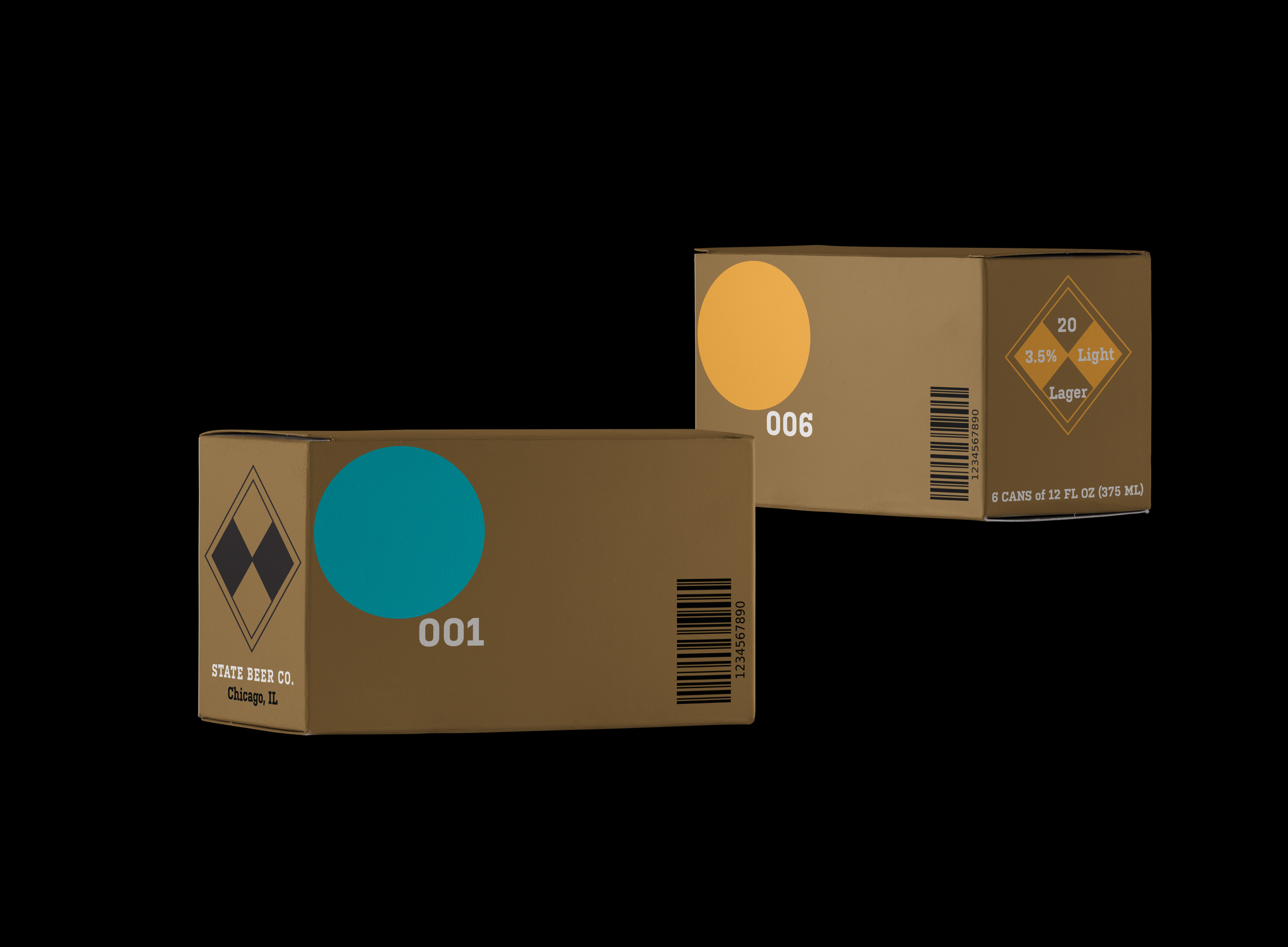
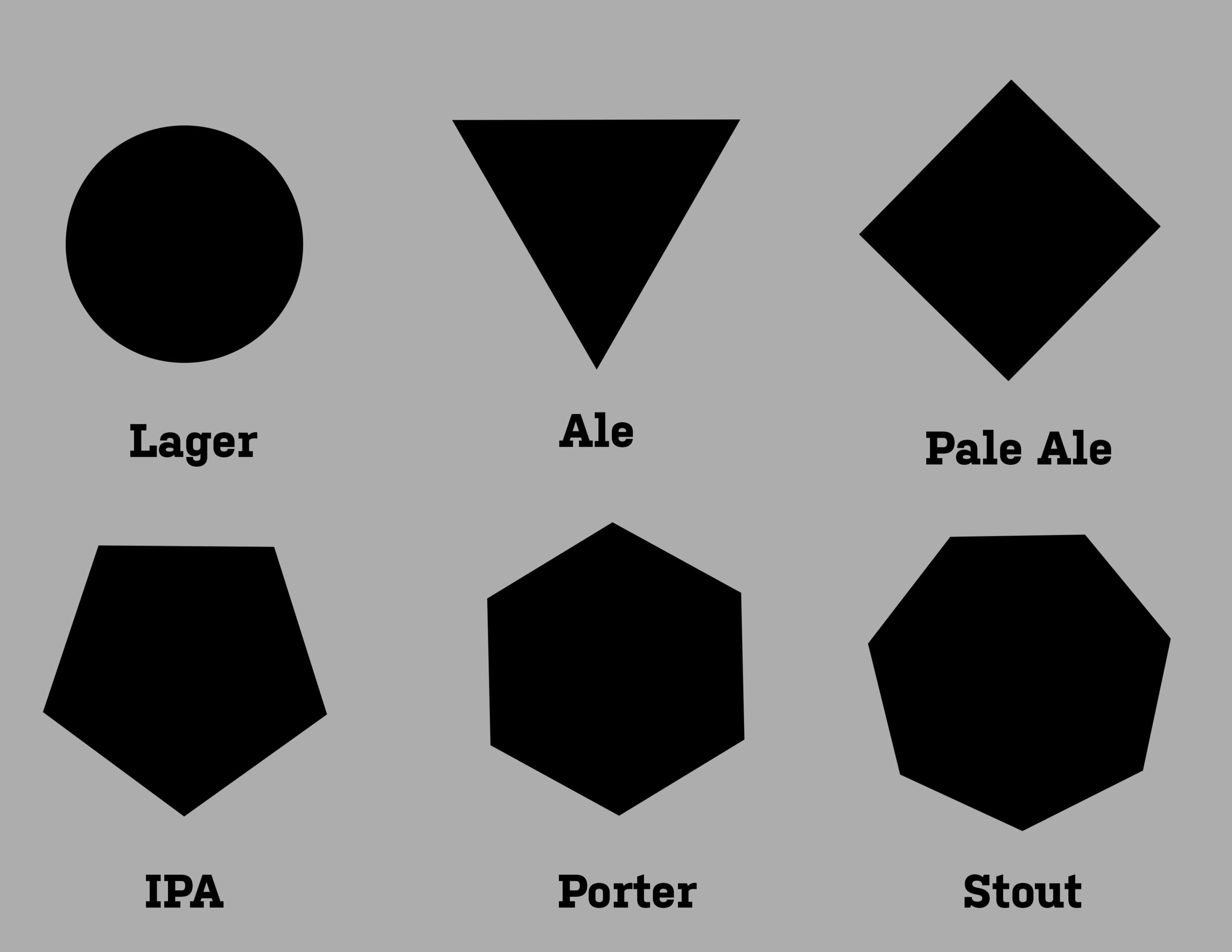
I set out to create a unique and idiosyncratic brand that stands out in a crowded craft beer market. I drew inspiration from the NFPA Hazardous Materials label to create the logo and I used a collegiate-looking font that would invoke a sense of uniformity and pride. Inspired by the Pantone color codes and minimalism I used both shape and color with unique numbers to identify each beer. The end result is both artsy and industrial. The great part of the design is that it can be understood at face value with all the product information clearly labeled on the packaging. However, discerning customers will be able to find the deeper meaning in the symbols and colors that add another layer of meaning.